Improving First Time Experience on a Community Platform: A UI/UX Case Study
Improving First Time Experience on a Community Platform: A UI/UX Case Study

About Steyp
Steyp is an Ed-Tech company run by Talrop, made for students to learn and become Computer Engineers and Tech Scientists irrespective of their age or educational background.
In this case study, I’m going to talk about my learnings from designing a community platform for students.
About the project
I’ve done a lot of different projects, from tiny ones to really huge ones. In this case study, I’ll share about one of the interesting projects I’ve worked on. I was the main designer throughout the whole project, but I collaborated with a lot of other folks too.
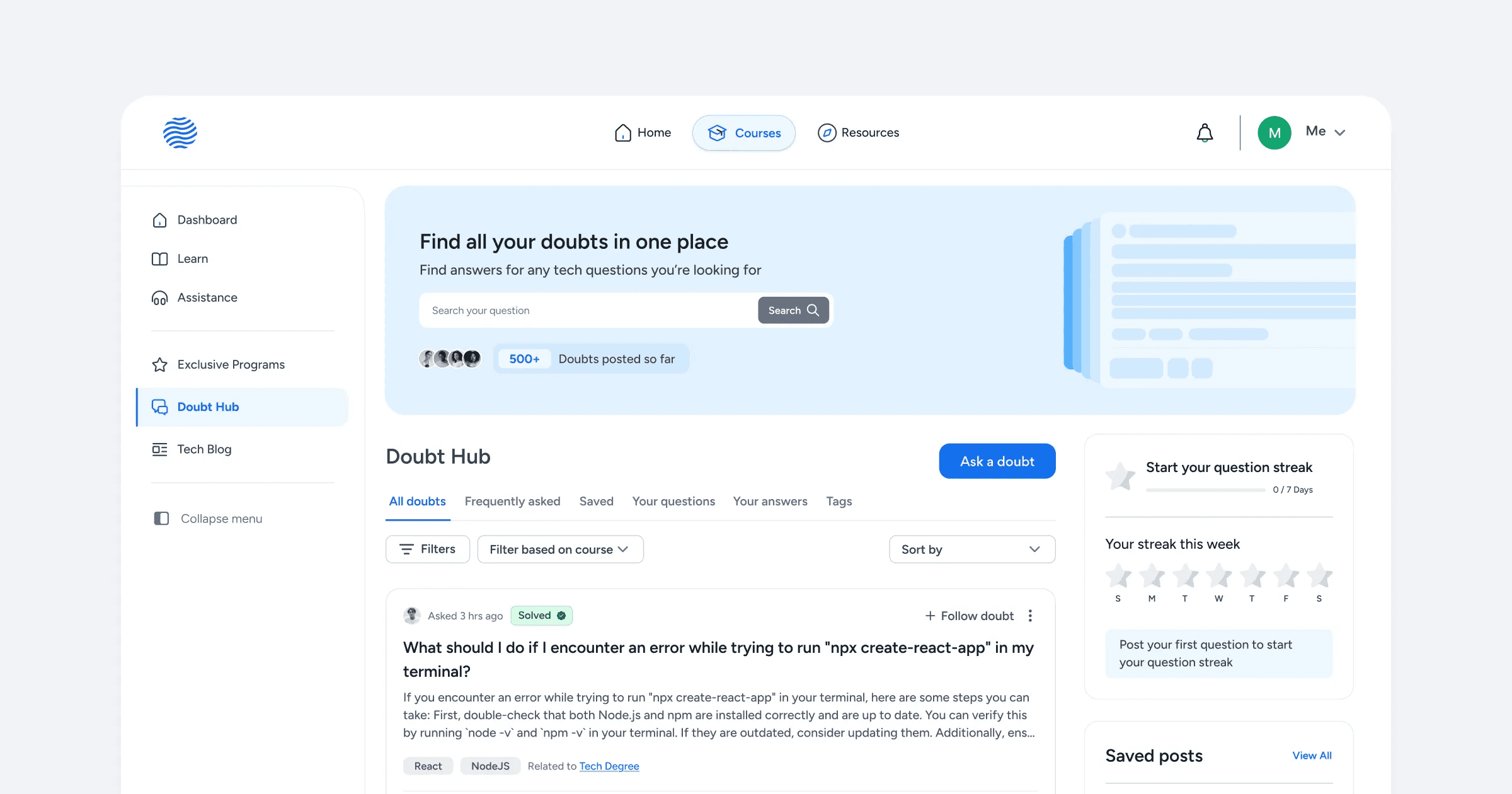
About Doubt Hub
Doubt Hub is a community platform within Steyp that facilitates asking and clearing doubts about programming, coding, and technical concepts. It aims to build an interactive space where students come together to ask and answer questions, similar to Stack Overflow.
A community-driven, friendly platform where students from grades 5 to 12th could help each other instead of relying entirely on professional support chat.
Understanding the context
With many students studying on the Steyp platform daily, it’s challenging to address every student's doubts. The platform has relied on support engineers to clear these doubts.
These support engineers are responsible for clearing coding-related doubts for students and earn a small amount of money on an hourly basis.
Support engineers are:
Full-time professionals: Employees currently working in the company.
Interns: Students who have completed more than a year of any advanced bootcamp and are capable of solving doubts for other students.
The problem
There were three challenges we had to think about:
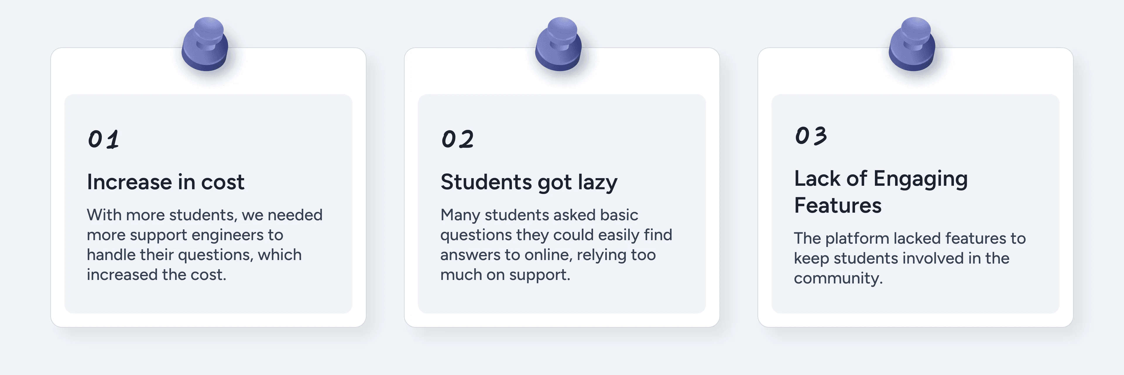
Increase in the cost of doubt-solving for students led us to think different solutions to solve doubts efficiently
Understanding the problem: My approach
I had to think about different sides of the problems, and they were:
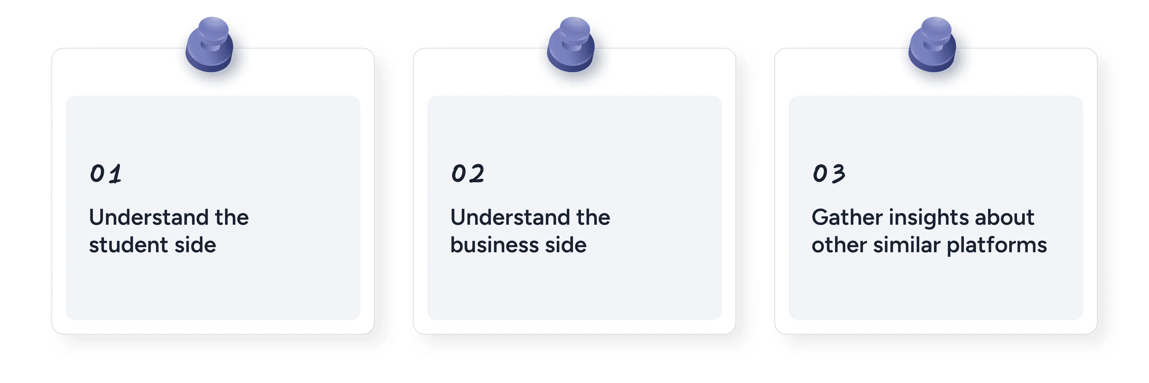
Understanding the Student Side
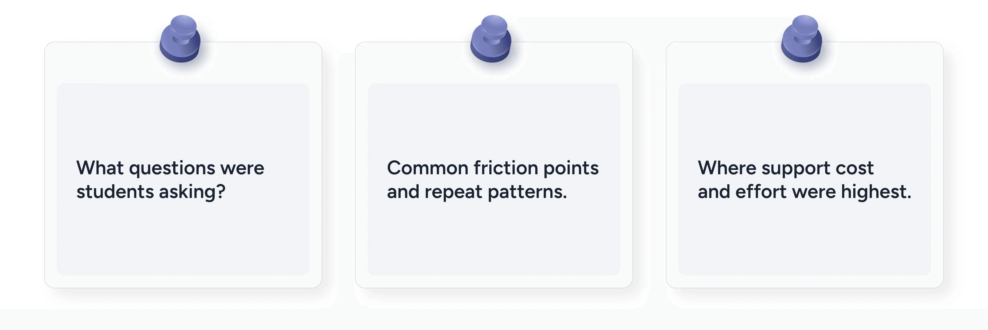
While I couldn’t speak directly with students due to access and timeline constraints, to get a sense of student needs, I started with qualitative interviews with support engineers, who interacted with the students every day.
I also had access to the support chat feature and used it to learn more about the students’ behaviors and needs.
It helped me understand:
This formed the basis for identifying user motivations and behaviors
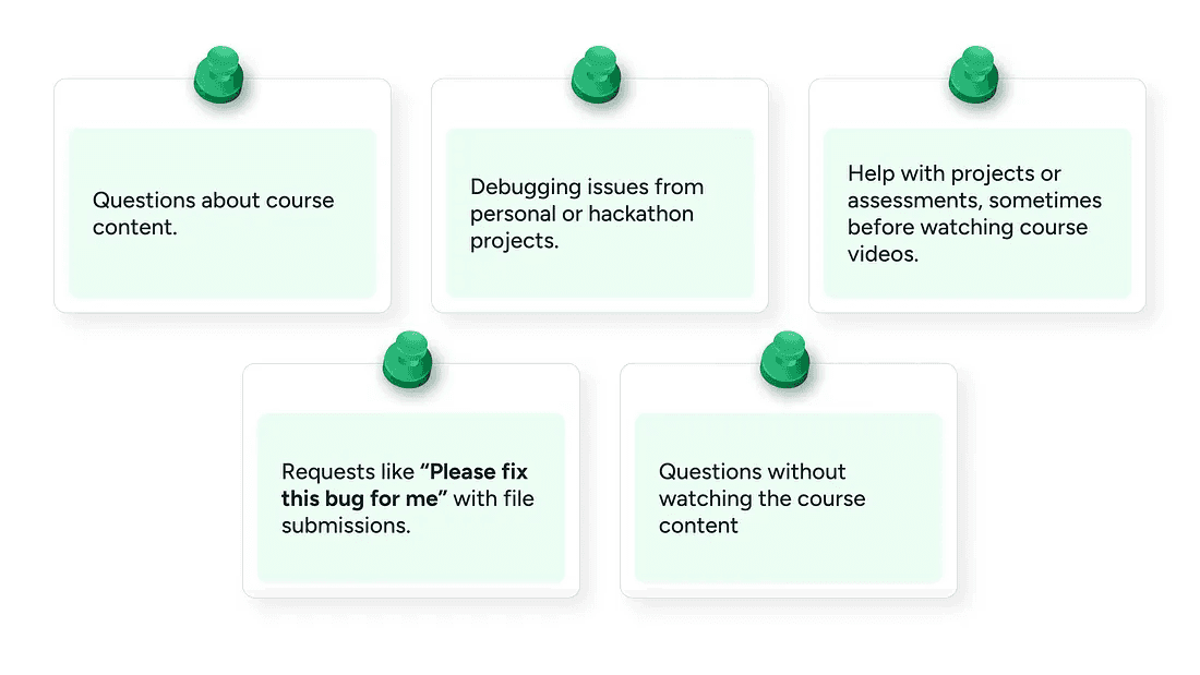
Students asked questions related to:
Understanding the business side
The whole project was initiated when the CEO came to me and talked to me about the new feature he wanted to add to reduce the support cost. To learn more about the business impact, I had several informal and formal meetings with the CEO and the Project Manager to understand the business goals and requirements for the feature.
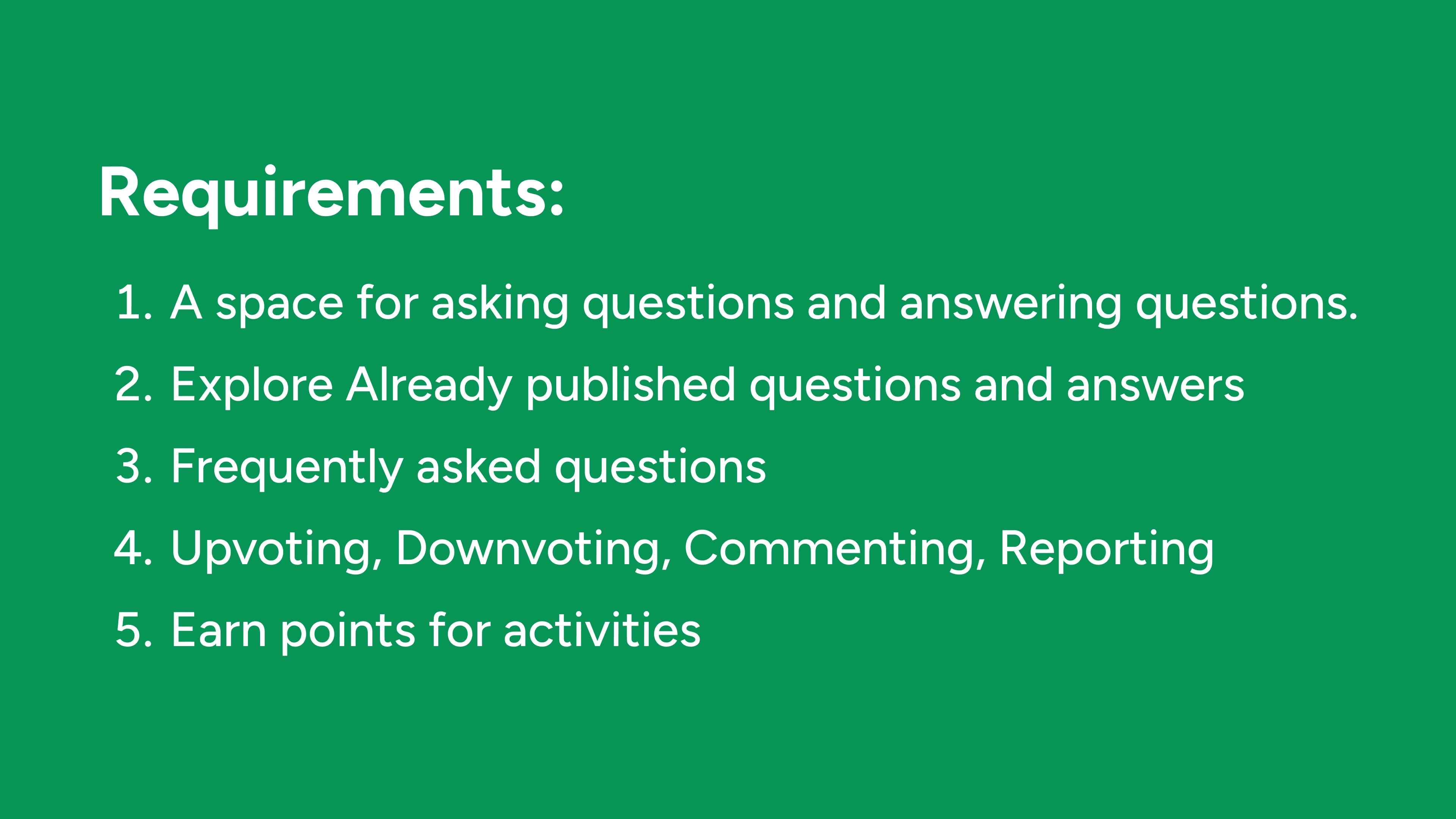
So, the project manager provided me with the requirements of the various pages that the platform should have and any new additions. Here is how the requirement briefly looked:
We also discussed the metrics we wanted to improve, and my solutions were based on that. I’ll talk about that more in the solutions section.
Competitive Analysis - UI Research
To design Doubt Hub, I looked at other community platforms to see how they handle posting questions and answers. I wanted students to find our platform familiar, so I looked at websites with established design patterns to guide my choices. I looked at design patterns from Stack Overflow, Reddit, Quora, and Internshala’s Community platform.
The Solution
2 core actions in the platform were:
Questions posted
Answers submitted and accepted
Questions posted and answers accepted drives the most impact as they’re directly tied to reducing the support tickets.
With this in mind I decided to focus on driving activation and engagement for these core experiences.
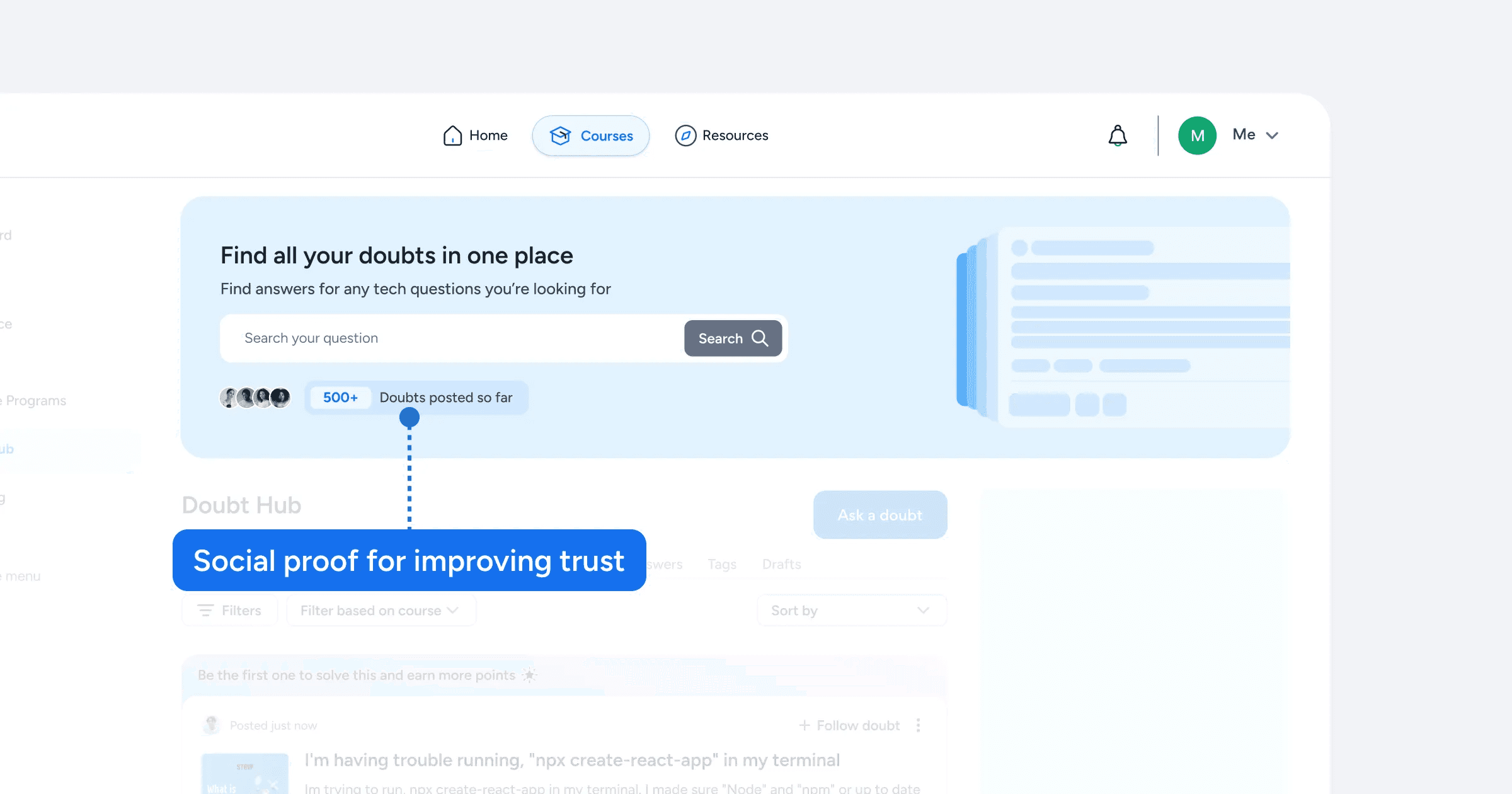
Question Discovery
The first thing I wanted to tackle was the question discovery page here’s why:
The feed page was the first touchpoint of value, if we don’t show the value soon enough, students could get uninterested and leave.
Since there are already students enrolled in the same courses it is very likely that someone would’ve already asked a doubt another student might have. It can help quickly build trust.
It can also be a place for early engagement.
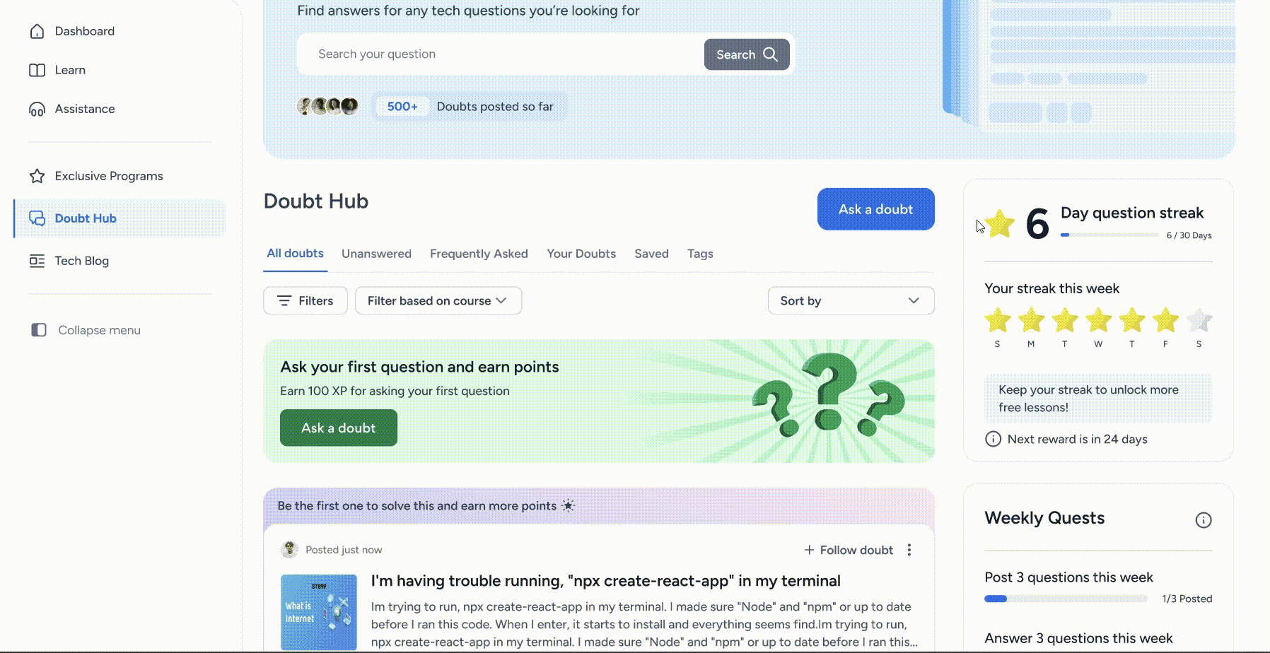
So, let’s break this down one by one.
The search bar is the first thing the student would notice, and it’s also another way to find doubts quickly.
Let’s look at question cards in detail.
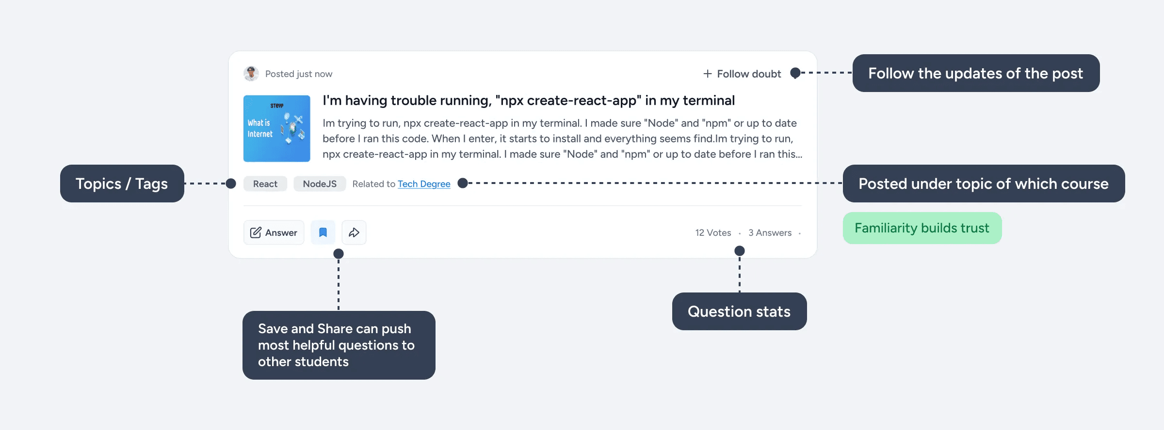
The upvote/downvote buttons were moved to the question details page because we didn’t want the students to just passively vote on a question without reading the whole question.
Before I came up with the final solution for the question card, I created other multiple solutions that didn’t work out well.
Driving the first key action
Since students were hesitant to ask their first ever doubt, we wanted to make it more rewarding and motivating to ask their first question which the key action was to see the initial value.
To initiate that I came up with a few solutions that were focused on driving activation.
Let’s look at them one by one.
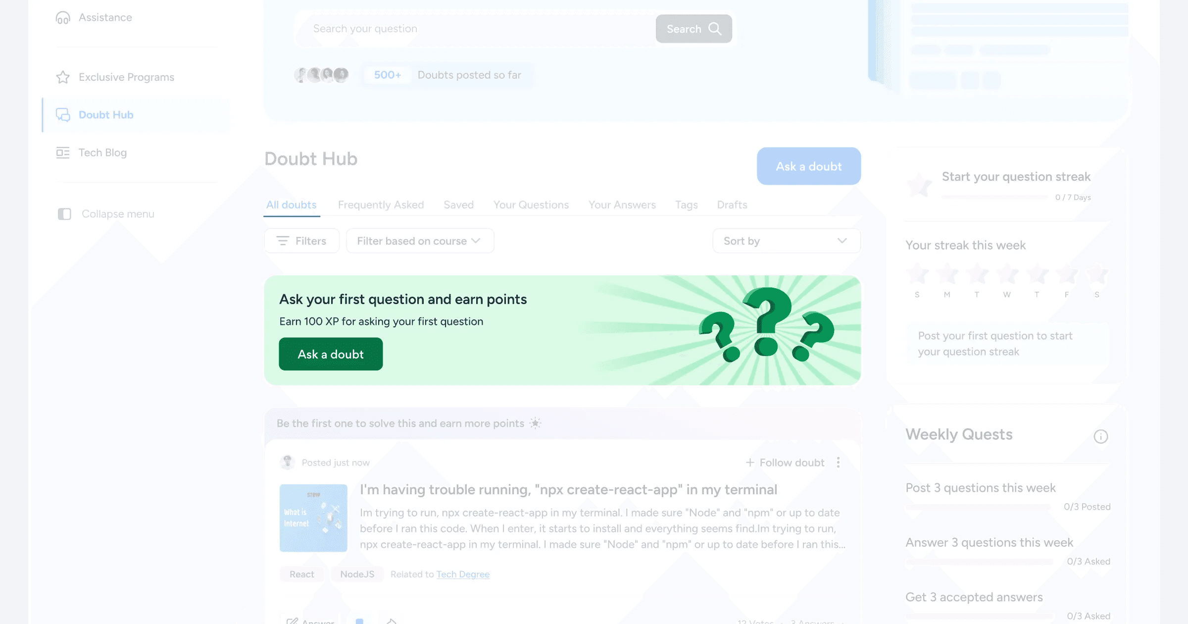
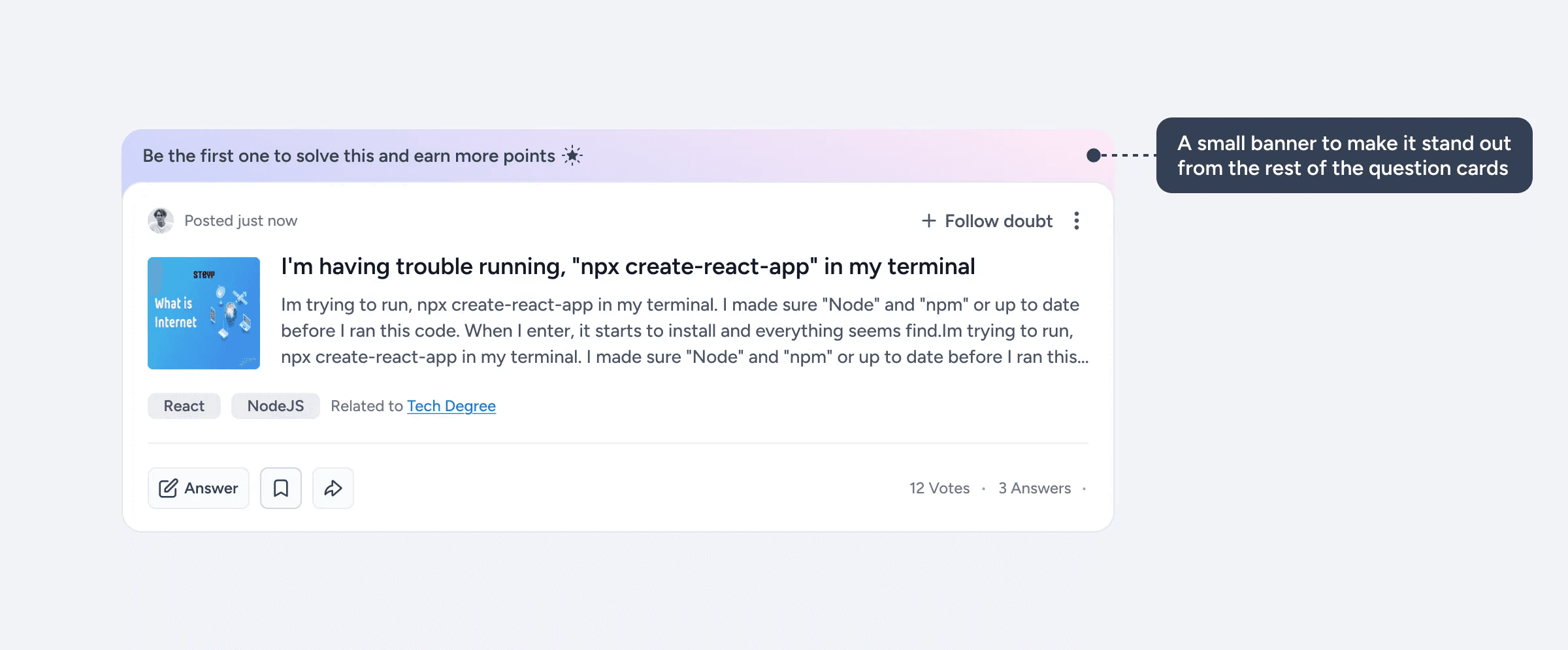
We already had a point-based leaderboard system in place, so the first obvious choice was to give points for asking their first question. To implement that, for every student who enters the platform for the first time they’re introduced to this banner.
Introducing Friction
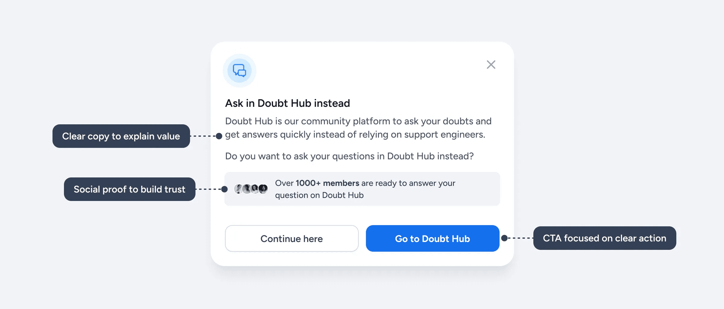
The next thing was to introduce friction when students go to the support section. For that I designed a modal that explains the value of Doubt Hub and redirect the students there when they reach the support page.
Answering questions
The 2nd core thing I wanted to solve was the core experience that’ll make the students stick to the community platform instead of relying on support engineers, which was:
Improving the average response time and frequency of right answers
We already have experienced students on the platform who’re capable of solving easy doubts, so all we had to do was nudge them to answer the questions.
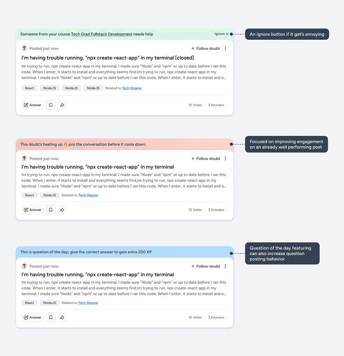
To improve the habit of answering questions, after lot of iterations, I came up with the idea of callout banner in the question card.
Let’s take a look at a few of the callout banners.
Based on the identified user behaviors, I made a couple of different callout banners that’ll make some questions stand out from the others, which can lead to more questions being answered quicker.
Asking question
A big part of getting the right answers quicker is by posting a good question because questions that are clear, well-structured and detailed are more likely to get a better answer rather than an unstructured and unclear ones.
To tackle that I made sure that the question edit page was clear and made it easier for students to write better question rather than just hoping that someone will understand their question and give the answer.
The key to getting the right answer faster is by making sure that the question is clear, well-structured and easy to understand.
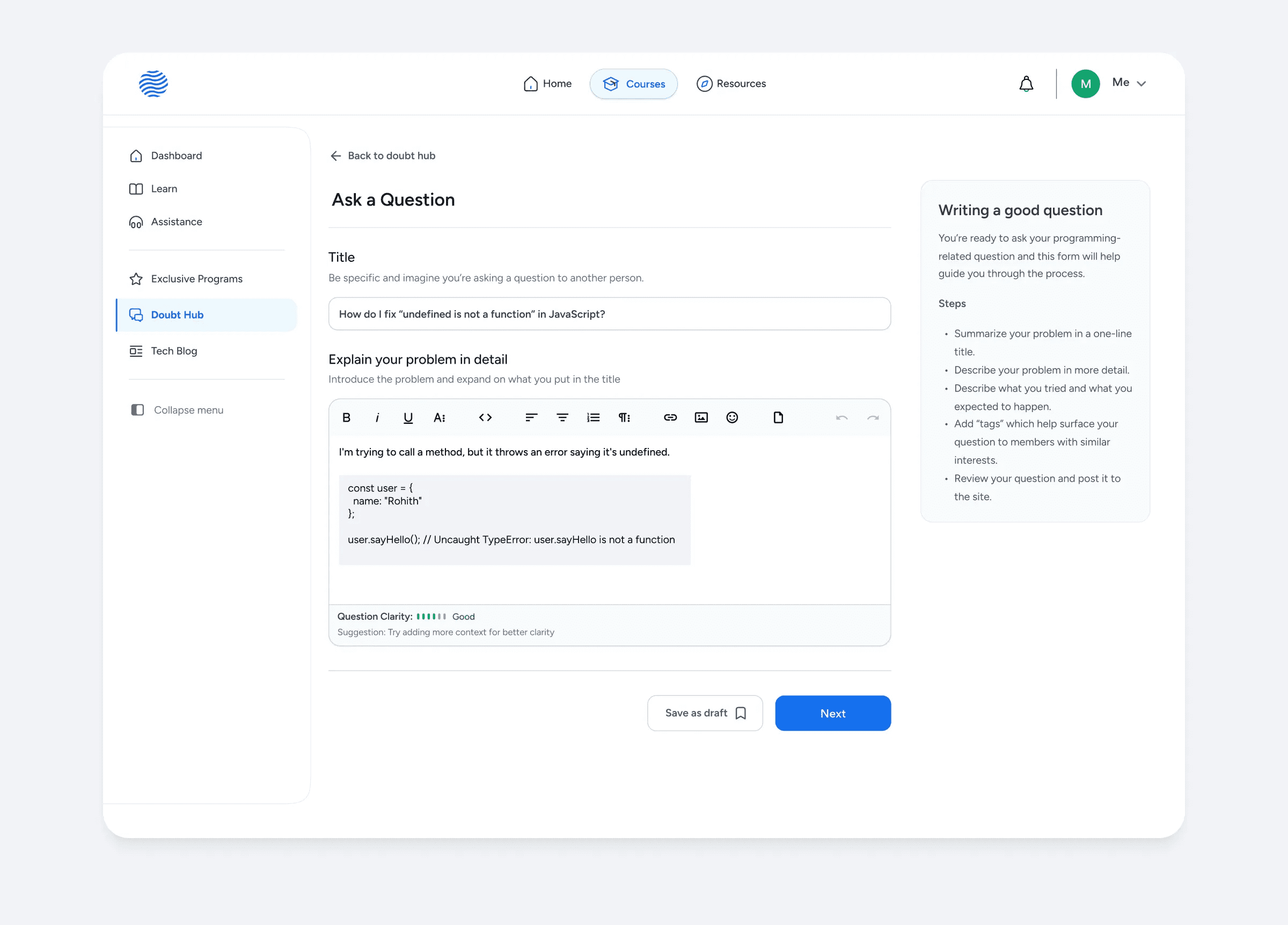
The question asking process was divided into 2 parts for reducing drop off rates and improving question completion.
Let’s look at some elements in detail.
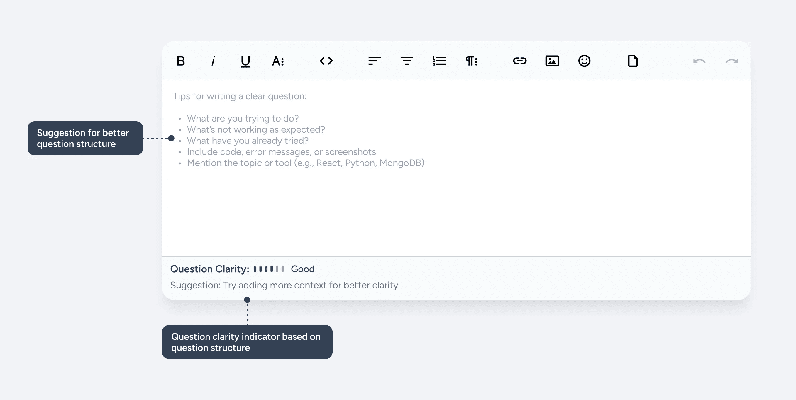
With the help of LLMs it has become easier to analyze text and its structure quickly, so with that in mind I designed a question clarity strength to provide students feedback on how clear their questions are, and a small suggestion based on that.
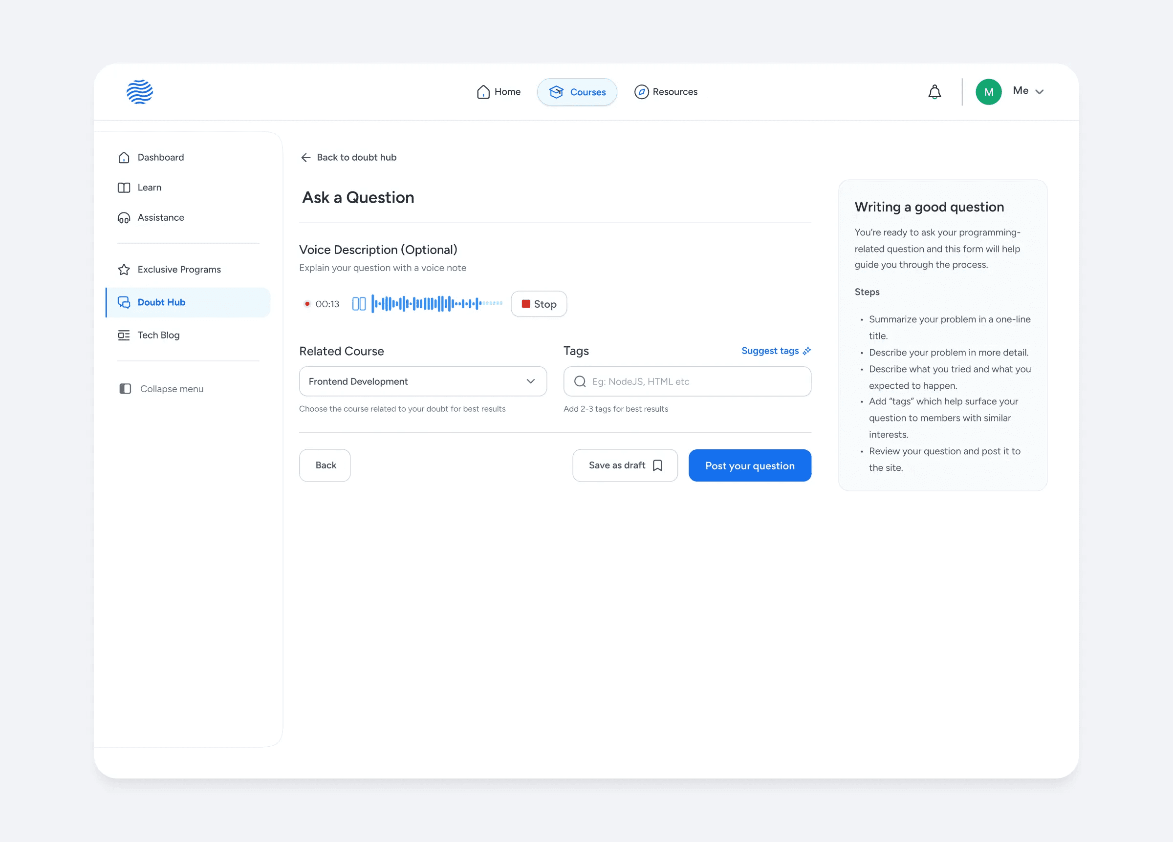
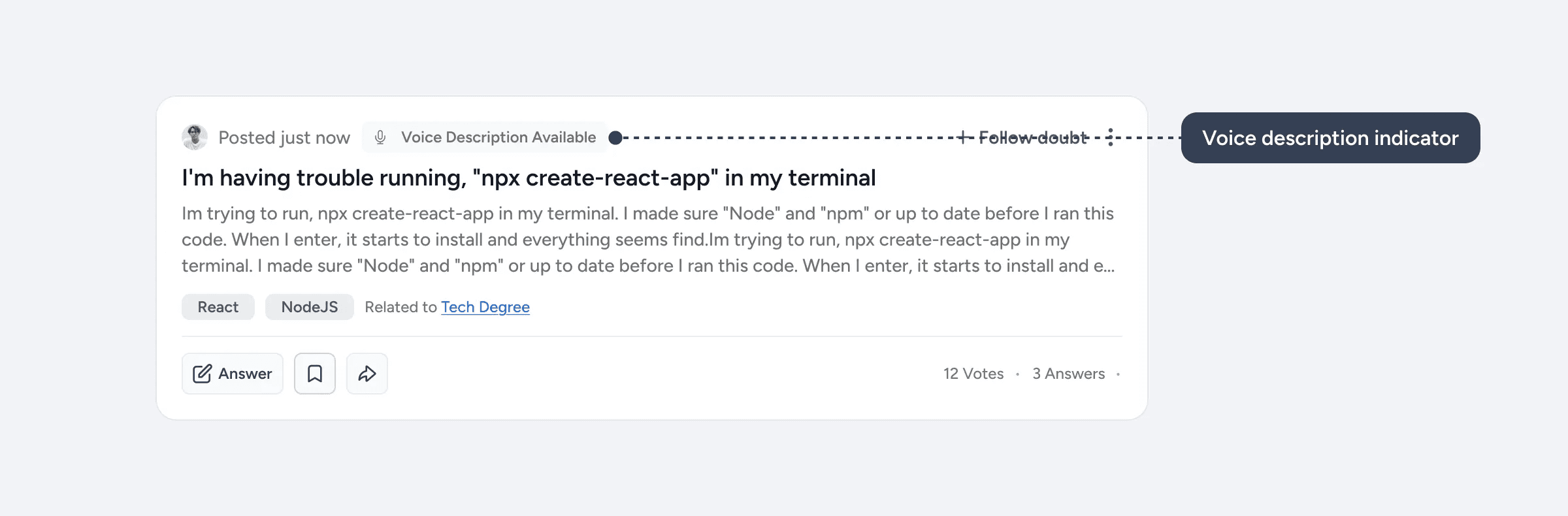
Since we had some students from 5th to 7th grade, we introduced a voice recording feature. This allowed them to articulate their questions verbally, even if they struggled with writing them clearly, ensuring their doubts could still be effectively communicated.
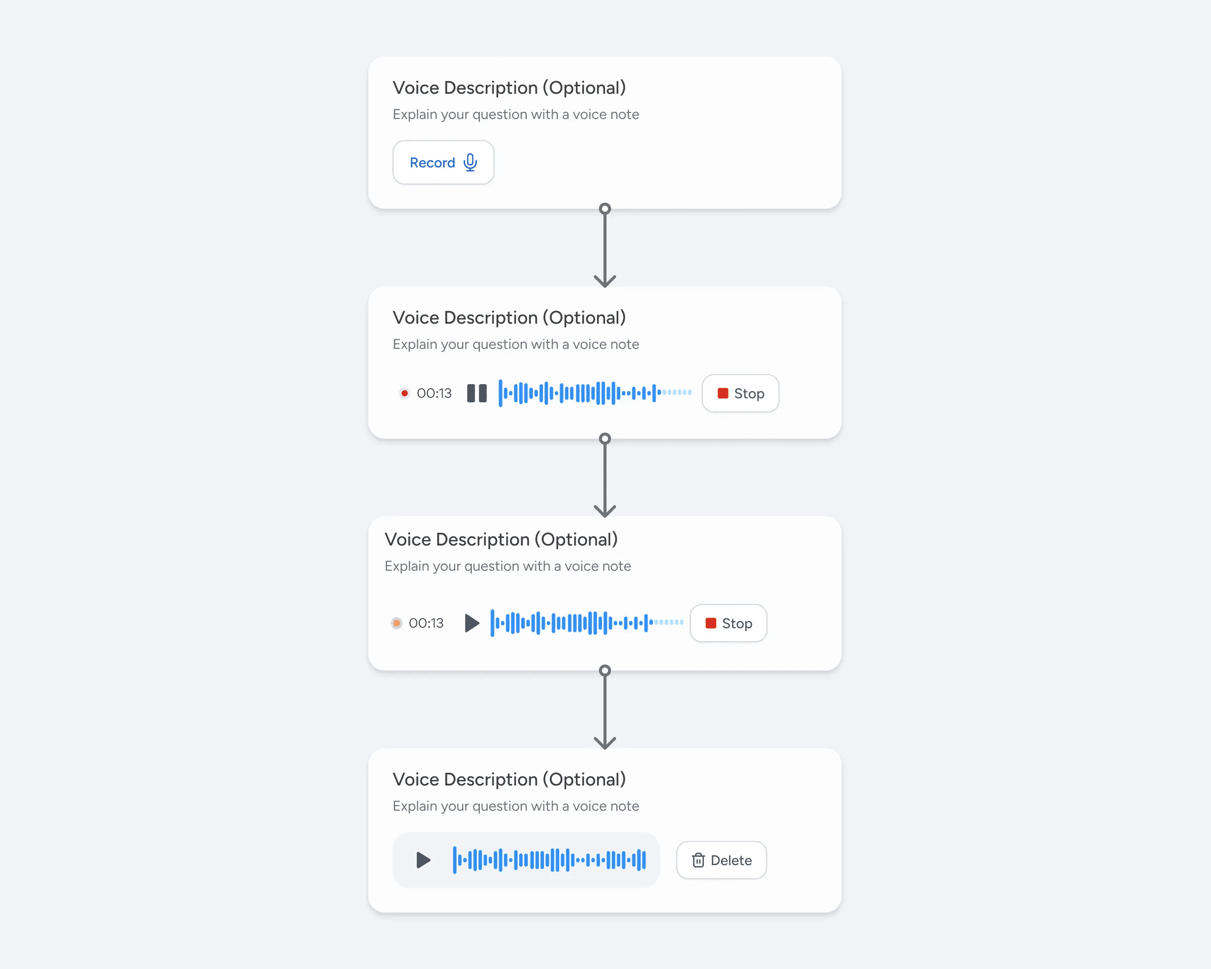
Since many students already use voice note option in the support chat this feature is projected to improve the question clarity.
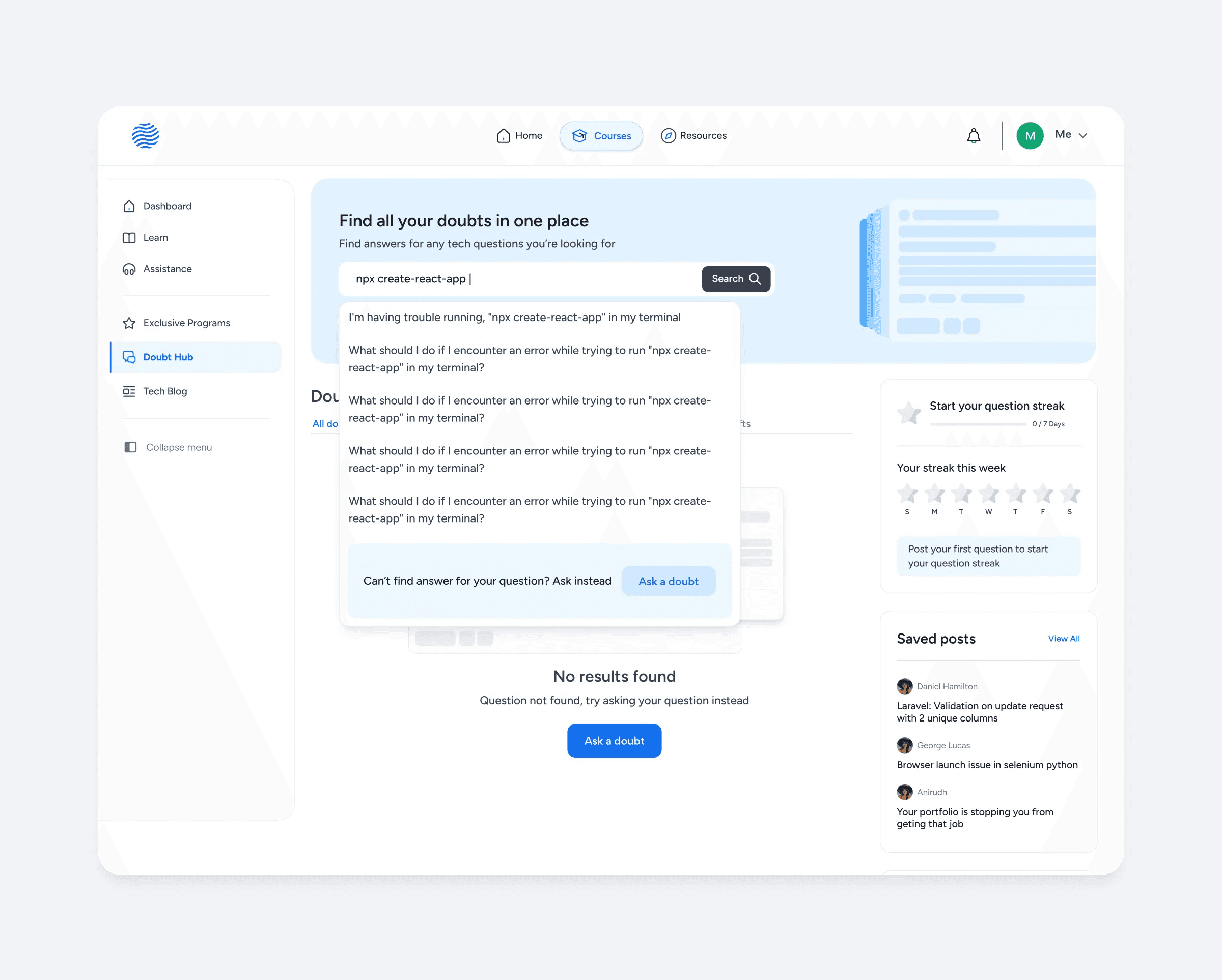
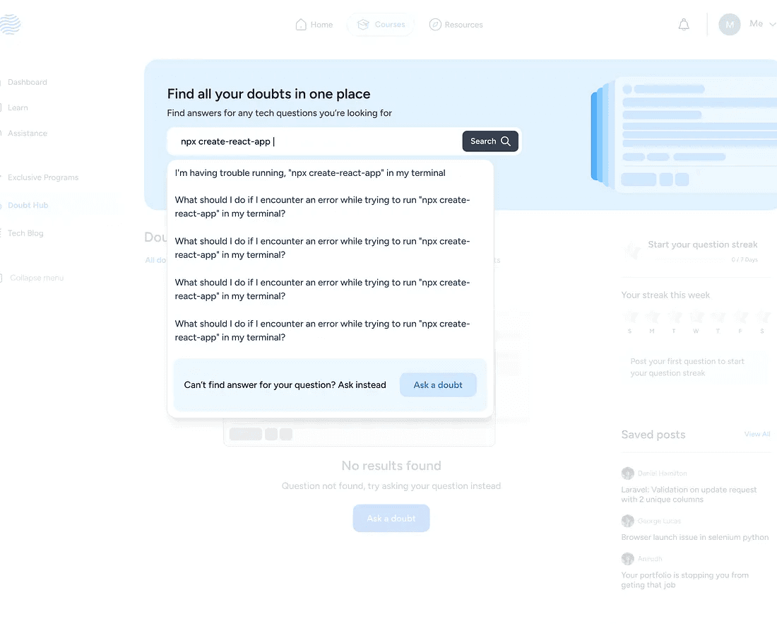
Decreasing the chances of a ‘No Results’ page
To avoid students running out into no results page while searching for question a nudge to ask question instead was added to the search dropdown. So even if they don’t find the right question they’ll be prompted to ask the question instead
Press enter or click to view image in full size
The Prototype
With the help of Lovable I made a prototype close to the end product. It’s not perfect but it helped me see how the end product will look like before it goes public, you can take a look at the prototype here:
Prototype Link: ask-hive-together
Impact
With the launch of Doubt Hub, we expect to reduce our support tickets and improve the overall engagement of our e-learning platform. There are few metrics that we have in mind that would benefit by launching the platform.
Feature Activation Rate: Since the feature is new, we hope that more students start using the feature more and start finding value from it. Some of the initial indicators would be:
- No: of questions posted
- No: of answers per question
- Avg time to first responseSupport Escalation Rate: No: of students who escalate their doubts to support would be a good indicator to know that whether the platform is working or not. A reduction in support escalation rate would indicate the students are adopting to the platform.
CSAT: CSAT helps measure how satisfied students feel after receiving help on the platform. A high CSAT would indicates the quality of answers and overall community experience.
Next Steps
Our next step would be to launch the feature and collect feedback from the students and change our approach accordingly. We also plan to scale it to a community forum like Reddit for all sort of doubts, queries and conversations.
The Conclusion
During this project, I developed my design process and learned how metrics would help make design decisions. I came to understand that product design is not just a user-centered process but also a business centered process.
Through this experience, I gained the confidence to approach any problem with logical reasoning and an appreciation for the various considerations that go into creating a successful and usable design.
You can find me on Twitter and Linkedin if you have any further questions.
About Steyp
Steyp is an Ed-Tech company run by Talrop, made for students to learn and become Computer Engineers and Tech Scientists irrespective of their age or educational background.
In this case study, I’m going to talk about my learnings from designing a community platform for students.
About the project
I’ve done a lot of different projects, from tiny ones to really huge ones. In this case study, I’ll share about one of the interesting projects I’ve worked on. I was the main designer throughout the whole project, but I collaborated with a lot of other folks too.
About Doubt Hub
Doubt Hub is a community platform within Steyp that facilitates asking and clearing doubts about programming, coding, and technical concepts. It aims to build an interactive space where students come together to ask and answer questions, similar to Stack Overflow.
A community-driven, friendly platform where students from grades 5 to 12th could help each other instead of relying entirely on professional support chat.
Understanding the context
With many students studying on the Steyp platform daily, it’s challenging to address every student's doubts. The platform has relied on support engineers to clear these doubts.
These support engineers are responsible for clearing coding-related doubts for students and earn a small amount of money on an hourly basis.
Support engineers are:
Full-time professionals: Employees currently working in the company.
Interns: Students who have completed more than a year of any advanced bootcamp and are capable of solving doubts for other students.
The problem
There were three challenges we had to think about:
Increase in the cost of doubt-solving for students led us to think different solutions to solve doubts efficiently
Understanding the problem: My approach
I had to think about different sides of the problems, and they were:
Understanding the Student Side
While I couldn’t speak directly with students due to access and timeline constraints, to get a sense of student needs, I started with qualitative interviews with support engineers, who interacted with the students every day.
I also had access to the support chat feature and used it to learn more about the students’ behaviors and needs.
It helped me understand:
This formed the basis for identifying user motivations and behaviors
Students asked questions related to:
Understanding the business side
The whole project was initiated when the CEO came to me and talked to me about the new feature he wanted to add to reduce the support cost. To learn more about the business impact, I had several informal and formal meetings with the CEO and the Project Manager to understand the business goals and requirements for the feature.
So, the project manager provided me with the requirements of the various pages that the platform should have and any new additions. Here is how the requirement briefly looked:
We also discussed the metrics we wanted to improve, and my solutions were based on that. I’ll talk about that more in the solutions section.
Competitive Analysis - UI Research
To design Doubt Hub, I looked at other community platforms to see how they handle posting questions and answers. I wanted students to find our platform familiar, so I looked at websites with established design patterns to guide my choices. I looked at design patterns from Stack Overflow, Reddit, Quora, and Internshala’s Community platform.
The Solution
2 core actions in the platform were:
Questions posted
Answers submitted and accepted
Questions posted and answers accepted drives the most impact as they’re directly tied to reducing the support tickets.
With this in mind I decided to focus on driving activation and engagement for these core experiences.
Question Discovery
The first thing I wanted to tackle was the question discovery page here’s why:
The feed page was the first touchpoint of value, if we don’t show the value soon enough, students could get uninterested and leave.
Since there are already students enrolled in the same courses it is very likely that someone would’ve already asked a doubt another student might have. It can help quickly build trust.
It can also be a place for early engagement.
So, let’s break this down one by one.
The search bar is the first thing the student would notice, and it’s also another way to find doubts quickly.
Let’s look at question cards in detail.
The upvote/downvote buttons were moved to the question details page because we didn’t want the students to just passively vote on a question without reading the whole question.
Before I came up with the final solution for the question card, I created other multiple solutions that didn’t work out well.
Driving the first key action
Since students were hesitant to ask their first ever doubt, we wanted to make it more rewarding and motivating to ask their first question which the key action was to see the initial value.
To initiate that I came up with a few solutions that were focused on driving activation.
Let’s look at them one by one.
We already had a point-based leaderboard system in place, so the first obvious choice was to give points for asking their first question. To implement that, for every student who enters the platform for the first time they’re introduced to this banner.
Introducing Friction
The next thing was to introduce friction when students go to the support section. For that I designed a modal that explains the value of Doubt Hub and redirect the students there when they reach the support page.
Answering questions
The 2nd core thing I wanted to solve was the core experience that’ll make the students stick to the community platform instead of relying on support engineers, which was:
Improving the average response time and frequency of right answers
We already have experienced students on the platform who’re capable of solving easy doubts, so all we had to do was nudge them to answer the questions.
To improve the habit of answering questions, after lot of iterations, I came up with the idea of callout banner in the question card.
Let’s take a look at a few of the callout banners.
Based on the identified user behaviors, I made a couple of different callout banners that’ll make some questions stand out from the others, which can lead to more questions being answered quicker.
Asking question
A big part of getting the right answers quicker is by posting a good question because questions that are clear, well-structured and detailed are more likely to get a better answer rather than an unstructured and unclear ones.
To tackle that I made sure that the question edit page was clear and made it easier for students to write better question rather than just hoping that someone will understand their question and give the answer.
The key to getting the right answer faster is by making sure that the question is clear, well-structured and easy to understand.
The question asking process was divided into 2 parts for reducing drop off rates and improving question completion.
Let’s look at some elements in detail.
With the help of LLMs it has become easier to analyze text and its structure quickly, so with that in mind I designed a question clarity strength to provide students feedback on how clear their questions are, and a small suggestion based on that.
Since we had some students from 5th to 7th grade, we introduced a voice recording feature. This allowed them to articulate their questions verbally, even if they struggled with writing them clearly, ensuring their doubts could still be effectively communicated.
Since many students already use voice note option in the support chat this feature is projected to improve the question clarity.
Decreasing the chances of a ‘No Results’ page
To avoid students running out into no results page while searching for question a nudge to ask question instead was added to the search dropdown. So even if they don’t find the right question they’ll be prompted to ask the question instead
Press enter or click to view image in full size
The Prototype
With the help of Lovable I made a prototype close to the end product. It’s not perfect but it helped me see how the end product will look like before it goes public, you can take a look at the prototype here:
Prototype Link: ask-hive-together
Impact
With the launch of Doubt Hub, we expect to reduce our support tickets and improve the overall engagement of our e-learning platform. There are few metrics that we have in mind that would benefit by launching the platform.
Feature Activation Rate: Since the feature is new, we hope that more students start using the feature more and start finding value from it. Some of the initial indicators would be:
- No: of questions posted
- No: of answers per question
- Avg time to first responseSupport Escalation Rate: No: of students who escalate their doubts to support would be a good indicator to know that whether the platform is working or not. A reduction in support escalation rate would indicate the students are adopting to the platform.
CSAT: CSAT helps measure how satisfied students feel after receiving help on the platform. A high CSAT would indicates the quality of answers and overall community experience.
Next Steps
Our next step would be to launch the feature and collect feedback from the students and change our approach accordingly. We also plan to scale it to a community forum like Reddit for all sort of doubts, queries and conversations.
The Conclusion
During this project, I developed my design process and learned how metrics would help make design decisions. I came to understand that product design is not just a user-centered process but also a business centered process.
Through this experience, I gained the confidence to approach any problem with logical reasoning and an appreciation for the various considerations that go into creating a successful and usable design.
You can find me on Twitter and Linkedin if you have any further questions.

Bottom Project Description